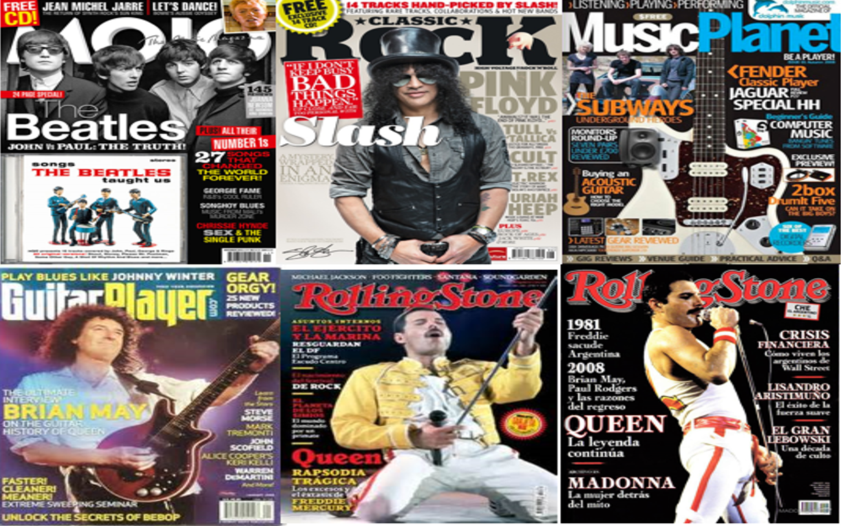
These magazines are similar to mine so to be conventional I've identified some devices used. Black, white and red are quite common colours used and so I've decided to use for definite, black and white and also a third colour that I haven't decided on yet. This colour scheme all belongs to that rock sort of genre conveying themes of rebellion. Unlike something like a pop magazine which would have light colours like pinks and blues. The cover models all seem to be mid-shots to show they're iconic outfits and instruments. Also in the questionnaire, the public preferred mid-shots of people on a magazine cover. Also the models are usually centre and not to the left or right with text on either sides. I admire the small things added to magazines like the models head being over the title making them more focal. This is the kind of layout I have planned for my magazine with a clear, neat format. I've had difficulty deciding what would be the background for my magazine. In these rock-style magazines, the background used is either a stage or just a block colour like black or grey so I will experiment with all these ideas. However with the grey background used in the top middle magazine. I don't like so much as the text being also in a grey colour scheme makes it difficult to read and not very eye-catching although it does compliment the model.
After looking at magazines as a collection from the rock genre I feel like this has really helped me decide on what ideas would be best for my own magazine front cover.
Good research Harriet. NS: upload a draft of your music magazine, so that we can see that you are using certain conventions that you have identified. It is good to see your work in progress.
ReplyDelete