Wednesday, 30 September 2015

Deconstruction of a magazine


This magazine is firstly, clearly a conventional one for having an attractive model for the front cover. This headshot is centred in the middle making eye contact with the reader making a connection with them. Also the massive 'Q' in the top left corner makes it obvious for regular readers that this is the magazine for them. 'Q' refers to the 'cue' on a record player carrying on the theme that this is a music magazine. The title 'Q' makes a short, snappy and catchy title for people to remember. This made me think more about magazine titles for my one, to keep it music related. The text is all san-serif meaning this is an up to date, modernized magazine with the latest gossip. However the text inside the logo is serif but conveys the idea that this magazine has history and has been around for a while and is still in fashion.

 The three main colours are white, orange and blue, the design uses these main colours so they don't over do it on the readers eye and it looks more professional. The orange and blue are complementary so contrast with each other; this makes the magazine stand out more amongst the other hundreds of magazines in the shops. this is important because the purpose of them is to make profit however there are other magazines with the same idea e.g. NME, Top of the Pops etc. Also the orange background supplies the cover lines with a good dark background to put white text over making the text more readable to the audience and they stand out more.

 The main cover line is the largest and most bold showing its significance compared to the rest of the cover lines. This will get the target audience's attention with the latest article. The quote "I feel so alone" is in the font serif to show that it is a quote and not just any old line. Also the fact that this famous, successful singer feels isolated will grab the reader's attention.


Friday, 25 September 2015

School Magazine Comparison


The task was to compare my school magazine to a real school magazine so I used Kettering Science Academy's 'Under the Microscope'.

Front Cover

Similarities

  • Both magazines have an obvious colour scheme, mine red and KSA's purple. This links into the school logo and stands out for the fact that that is the purple school and it becomes conventional. This is what I want for my magazine but maybe convey this through other devices rather than just colour.
  • Watermarks are also used on both which makes them look more professional and it is a good theme to have through out the magazine pages.

Differences

  • Instead of cover lines KSA used miniature pictures on the side of their cover which like cover lines, tells you what's in the content of the magazine. I found this unique but I'd have to experiment more with idea if it was going to work with a music magazine.
  • KSA has an article on their front cover which doesn't look eye catching but in a school magazine the purpose is different to music one. School magazines are to inform students, parents and other audiences associated in the school about the latest news on the school. Whereas music magazines are to entertain people about what's going on in the music world and to compete with other magazines. Unlike KSA's magazine, music magazines are in competition with others and are trying to make a profit.

Contents Page


Similarities

  • Both have watermarks carrying on the theme. Mine is of the school logo to remind the audience this is a school magazine whereas KSA's is just a pattern to make the page more exciting.
  • Both have followed through the colour scheme making these magazines more effective and professional.

Differences

  • My contents has a few pictures hinted what is in the article and numbers matching the article number.
  • The contents page for KSA's is not just a contents page but has an introduction as well which I hadn't thought of. I  like the idea of having a small bar on the right with the page numbers and will consider this for my music magazine. 


Tuesday, 22 September 2015

Contents Page


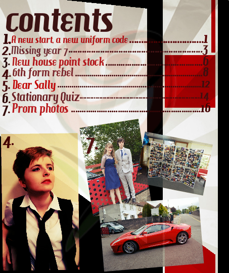
My main aim was to keep the same format and theme between my front cover and my contents page however my contents page looked even better than my front cover so I went back and improved it.

 
I improved it by adding a warm filter making the magazine stand out from the others more and made the overlay darker. The main colours are red, white and black you can see a clear resemblance between the two pages.
 
I wanted to create a design different to other magazines however keep a similar, conventional layout. My magazine has a retro theme because I would like to make a magazine for retro music so I experimented with different colours, fonts and layouts.

Saturday, 19 September 2015

School magazine


Our first task was to invent our own school magazine front cover.


Friday, 18 September 2015

Fonts

The different types of fonts used in a magazine.

Serif- which is a font with tails and feet on the ends of letters.

Non-serif- which is a font without tails or feet and is seen to be more trendy and used in modern magazines whereas serif is more traditional.

Handwriting- this is a font which looks hand written but is obviously typed but is seen to be more person and is used by authors if they have a message to the reader.

In my own magazine I'm considering to use serif fonts to relate to an older audience to try and bring back the past and be more retro. Having a different font to the rest of the modern magazines will then stand out and be more unusual.


Thursday, 17 September 2015

Research Methods

We first discussed what primary and secondary research was.

Primary Research


Primary research is gathering your own information that does not already exist. We can do this by telephone interviews, surveys or questionnaires etc. Primary research is good because  it is your own and unique and it means you aren't plagiarising so I will definitely use as much primary research as possible in my music magazine project.

Secondary Research


Secondary research consists of research someone else has written and is not your own. We can do this by using the internet, books or newspapers. In my project I'll put all my findings in my own words or at least reference the original source.


We next brainstormed different research methods, primary and secondary;

Quantitative Research 


This is research that is numerical, patterns and trends that may even be presented as a graph. For example, questionnaires will result in answers that can be presented in a pie chart, for example 'Which front cover do you like best?'

Advantages                                                            Disadvantages                                                             
-It is quick and easy questions to                          -People may not answer honestly if asked on paper
 answer.                                                                 -People may not bother answering the questions
-Good way to answer decisions you                     -You can't get detailed answers or opinions and  
 cant decide yourself.                                              suggestions to improve the front cover
-Can easily find out what is popular                     -The wrong target audience may be asked
 and what is unpopular to the public


Qualitative Research 

This is based on opinions, thoughts and feelings about the questions which can provide you with suggestions to improve your idea and develop it for the public. For example an interview with a focus group can provide you detailed responses.

Advantages                                                              Disadvantages                                                           
-This can help you develop and improve                -Going through detailed answers and questioning  
 your original idea and make it better for                 will take a long time
 the public
- Answers that are supported with opinions
 can help solve problems and prompt you
 with new ideas.


 Examples of Primary and Secondary Research Methods


Sunday, 13 September 2015

Magazine Terminology

Text

  • Font
  • Sell line
  • Cover lines
  • Serif
  • San-serif
  • Handwriting
  • Masthead
  • House style
  • Skyline
  • Centre Spread
  • Earlug
  • Bleed
  • Off register
  • Pug

Images

  • Camera Shots- Big Close Up (BCU)


-Extreme Close up (ECU)


-Midshot


-longshot


  • Colours- contrasts, what do they represent?
  • Mise en scene;
      -Costume
      -Lighting; high key, low key, back lit
      -Hair
      -Make-up
      -Setting
      -Props