Monday 30 November 2015

Contents Page First Draft


For a first draft, I think I did pretty well overall, although I am not happy with some aspects of this page. Like the front cover draft, I found it useful for my second draft to point out some of the positive and negative points to this draft.  

Positives

  • I like the overall layout and design of the page with the grey, translucent boxes and the model on the right. I also like the top half with how the title is separated through the lines. 
  • The model is the same as the front cover as this is the main story. however the model is in a different pose, strumming the guitar instead of making eye contact in Mercury's signature move. 
  • Also the colour scheme is toned down for a calmer, relaxed mood. The retro overlay is also continued which I like.
  • I continued the same fonts from the cover page. The title logo from Amplify is the same as the font used for the Contents. also the same font used on the cover lines is used in the article titles.

Negatives

  • There is too much negative space in this page so I need to think of more text to add and what other conventions contents pages convey.
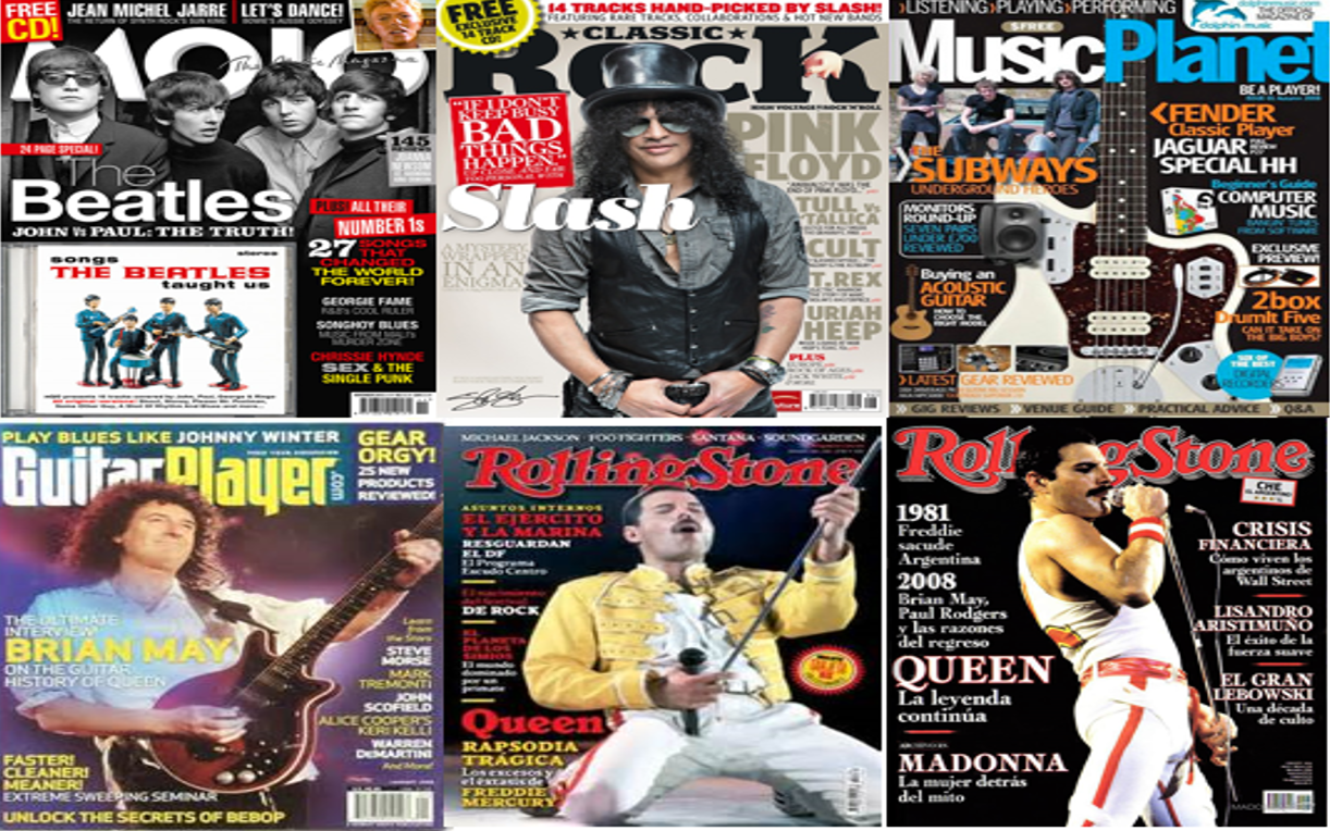
  • I'm also not sure if I should carry on with the same model. I have looked at music magazines and the model on their contents page is different to the front cover so I will try to experiment with different imagery, I found an example of this below, the cover story continues through the it standing out from the other articles. It sections itself off from other articles.
  • I think the text is all quite equal whereas I want the main story (my double spread) to stand out. The Freddie Mercury story.

Tuesday 24 November 2015

Front Cover Draft 2


Even though I have made a massive improvement compared to the first draft there are still things I need to add to improve this further. The tag line is still too hard to read due to the colour between backgrounds so I will have to make it orange to match the guitar and sticker. I also want to change the website's font as it doesn't go with the rest of the fonts so I want to make it serif as it is drawing to much attention away from the focal point. I like the 'free cd' sticker in the corner however I don't think that colour orange goes with the rest of the magazine. I wont to make it the same colour as the guitar. I like the boxes with the 'the true story' and 'uncovered interviews.' I found this a good technique of highlighting what's important about this story hence 'the true story'. And was a good way of showing subtitles hence, 'uncovered interviews'. I also added the quote the Freddie quote and used a handwriting font to make this seem more personal. I wasn't sure if I should cover the guitar or not although it does draw attention away from the face and putting text over it, it will make the face more focal.

I based this cover around Mojo magazine's front covers. I was inspired by the 'exclusive' to use the boxes. Also the tag line being over the title with the hand writing font to highlight that my tag line is a personal opinion. To show that the Freddie Mercury story is my main headline, it is the only cover line to cross over the model like in Mojo's.
 
Also to improve my own magazine with having the font in the name bigger than the rest of the article in the cover line. I could use this idea for the Rick Astley's resurrection.
 
The top half of my magazine is entirely based on Mojo's. with the sticker on the left and I also need a picture of a Beatle on the right on mine. The picture can also overlap the title like in Mojo's.


Thursday 19 November 2015

Intertextuality

This concept of using something to reference something else is basically my whole magazine. As my magazine is based on past music so all of my bands and artists are real and linking to past musicians.

 Some of references refer directly to the original like in 'remakes' of films. I tried to find my own example of this. Like when Adam Lambert joined Queen for a new tour however they called this Queen + Adam lambert in order to not replace the one and only Mercury. His image is still quite 'Freddie' though, his gestures he uses imitates those of Mercury's and his clothing choices with his leather jacket and tight trousers are similar.


When the audience see's through this they feel quite proud of themselves. These audience pleasures can encourage them to carry on buying or start buying magazines so they can enjoy spotting these patterns in music. I could write about Adam Lambert in my magazine and imply this to the readers but make them think they came up with it.

Thursday 12 November 2015

Are music magazines doomed?


Yes.

 Regular weekly and monthly magazines have dwindled. Less and less people buy magazines and they are then slowly dying off. They then rely on their faithful audiences, 'fifty quid blokes' going to WHSmiths every week to keep them alive. But when this generation dies, what will happen to music magazines?

 And if people buy magazines to get information about their favourite band why buy it in a magazine when you can find it on the internet in a matter of seconds. In this day and age people don't want to be driving or walking to town to buy a magazine when they can simply type it in on google. In my opinion I would also type it into google however, it is only because I haven't found a music magazine that I like and will buy every week but otherwise I would.

 Devices such as ipads and kindles and other technology is directing us away from paper altogether therefore magazines and books will become extinct. Instead of book illustrators it is now all about graphic design. With phones in our pockets what is the need to go down to the shops for a music magazine while the information is just in your pocket.

 Magazines are also quite pricey which I have found annoying as well. However with more people getting this information online magazines are forced to higher the price because they need high sales to stay in business.

No.

 People said that when TV came about, people thought that cinemas would go out of business and shut down. Or people thought as breakfast TV started, it was thought that radio was doomed but these things carried on and survived. Music magazines might just be another one of these stories.

 Every year £2 billion of magazines are purchased and 2.6 million are sold every day in the UK. Diane Kenwood in TimeUK quoted that "They're read by 87% of the British population.' So according to statistics magazines are far from 'doomed.'

 People also don't want to subscribe online to newspapers or magazines because it still costs to subscribe.

Steve Auckland from Metro publishing said "90% plus of our money is coming from print." He said in publishing.


 In my opinion music magazines aren't doomed, everyone thought that cinemas were doomed and this is another one of those scares. I think just because the younger generation aren't that into magazines doesn't mean they are all doomed, and maybe as they grow older they will mature into buying magazines. Also the fifty quid block buys music magazines so he can revisit past music so maybe when the younger generation grow older they will also buy music magazines to look up the music of today in the future.

Cover Draft


Evaluation of my first front cover draft

Positives
  • So far I like the model image and the conventions I've conveyed as told in the Prezi.
  • The few text that is on there surrounds the model and doesn't cover the model.
  • The title sits behind the model.
  • The colour scheme is obvious and easy to point out what are the three main colours- beige, black and white.
  • I also like the unique stage of the model being 'in action' and the retro over lay.
Negatives
  • The main cover line is too small in size and I have gone off the font.
  • The selling line is not readable and not noticeable enough which I will definitely have to alter.
  • I also need to add in the little things such as the issue number, release date, freebees etc. to make this look more like a magazine.
  • I'm not so sure about the shadow and size of the masthead but I'm happy with the font.

Thursday 5 November 2015

Similar Magazine Covers


 These magazines are similar to mine so to be conventional I've identified some devices used. Black, white and red are quite common colours used and so I've decided to use for definite, black and white and also a third colour that I haven't decided on yet. This colour scheme all belongs to that rock sort of genre conveying themes of rebellion. Unlike something like a pop magazine which would have light colours like pinks and blues. The cover models all seem to be mid-shots to show they're iconic outfits and instruments. Also in the questionnaire, the public preferred mid-shots of people on a magazine cover. Also the models are usually centre and not to the left or right with text on either sides. I admire the small things added to magazines like the models head being over the title making them more focal. This is the kind of layout I have planned for my magazine with a clear, neat format. I've had difficulty deciding what would be the background for my magazine. In these rock-style magazines, the background used is either a stage or just a block colour like black or grey so I will experiment with all these ideas. However with the grey background used in the top middle magazine. I don't like so much as the text being also in a grey colour scheme makes it difficult to read and not very eye-catching although it does compliment the model.

 After looking at magazines as a collection from the rock genre I feel like this has really helped me decide on what ideas would be best for my own magazine front cover.

Wednesday 4 November 2015

Publishers

The two main publishers in the UK are Bauer and TimeInc.UK

 
It is the largest publishing group in Europe, publishing in Germany, France, Spain, Portugal, the United Kingdom, Mexico and the United States. Founded in Hamburg, Germany by Johann Bauer in 1875, Bauer was then ran by four generations of the Bauer family. It has evolved from a small printing house to the owners of the global empire of 282 magazines in 15 countries with 6,600 employees with an annual turnover of 1.79 billion euros. They are the proud owners of Kerrang, Q, Mojo and many more.


TimeInc originally known as IPC Media was founded in 1963. They sell over 350 million copies each year. Before 1963 TimeInc was a collection of companies who all came together and called themselves the International Publishing Corporation, IPC. They now publisher magazines such as the Horse & Hound, Uncut, NME and more.
   

Independent Publishers

More magazines from 'indie' genres are published by independent magazines or are self published.
 
 
The magazine 'Shindig' is published by the independent publisher, Silverback Publishing. Shindig are not as popular as magazines like TimeInc or Bauer and appeal to a niche audience. They have fought to stay in business and relied on their fans to keep Shindig alive. Silverback have only been in business for two years so they haven't got much of a history.
 
 I would prefer to have my magazine published by a more successful publisher so I can reach my mass audience and make more profit even though it would be a massive accomplishment to be self-published.